6 Basic Typography Blunders that Make You Seem Clueless

Typography can be a tricky beast to tame. There are so many fonts, so many rules, and so many ways to break those rules.
A lot of finding out what looks good and what looks like crap comes from experience, but there are some basics that every designer should know.
If you don't want to seem clueless when it comes to typography, read on.
Typefaces vs. Fonts
If you don't already know, typefaces are not the same as fonts. A typeface can contain many fonts.
For example, the Helvetica typeface consists of many fonts such as Helvetica Light, Helvetica Roman, Helvetica Bold, and so on.
For the purpose of this article we will be using the two terms interchangeably.
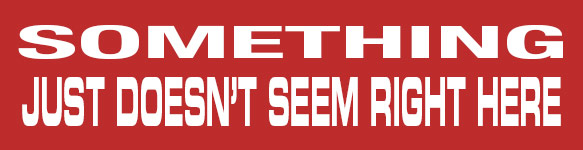
1. Using Too Many Typefaces In One Image
One of the most common mistakes aspiring designers make is using too many different fonts in a single image.
A good rule of thumb is to use no more than 3 different typefaces in conjunction with one another. There are always exceptions to the rule, but for professional, solid looking typography, keep the count to a minimum.

2. Using Mismatched Fonts
You may have a library of 1,000 beautiful fonts, but that doesn't mean you can combine them on a whim.
Eurostile may look great with Gotham, but horrible with Garamond, and it is not as simple as separating serifs and sans-serifs.
With so many possible combinations, how will we ever know which ones to use? A lot of comes down to practice, but luckily, there are some resources online that help us with the basics.
- Douglas Bonneville's 19 Top Fonts in 19 Top Combinations Chart
- AS8's Handout on Mixing Typefaces

3. Using System Fonts
Operating systems nowadays come with so many standard fonts, you wonder why anyone would buy any more.
- Many of the fonts on computers were designed for screen reading, not design, meaning that they were specifically created to be used in paragraphs of relatively small text to be read on a computer monitor.
- They look too "standard". Everyone has them, everyone uses them, and you don't want to be everyone.
Unless you are using them on a website, steer clear of Arial, Times New Roman, Tahoma, Courier, Verdana...

4. Using The Wrong Fonts
Using the right font in the wrong place can be just as bad as using the wrong font.
Using a geometric font like Futura for a kids flyer, or using Papyrus for a corporate memo just doesn't make sense. Your typeface choices should match the feel of their intended purpose.
Oh, and there is one font that should never ever be used in any situation ever, Comic Sans.

5. Distorting Typefaces
Let's say you have a space to fill that is 4" wide and 1" tall. The phrase you need to use, "Free Shipping", is 4" wide but only 1/2" tall. What is the logical thing to do?
If you said, "Stretch the text vertically to fill the space," I want you to reach out your right hand, stiffen your fingers into a firm plane, and slap yourself across the face.
Fonts are designed with varying stroke thickness for a reason and they look immature and stupid when you stretch them.
Use a condensed font, adjust the tracking (spacing between letters), or do just about anything else besides distorting the font in one dimension.
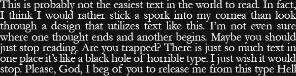
6. Suffocating Text
Have you ever been reading for a long period of time and realized your eyes were hurting? It can be because what you are reading has too much contrast, or more likely, there is no breathing room to give your eyes a rest.
For some unknown reason, many programs have tight letterspacing, short line heights, and no padding around paragraphs of text by default.
When you are designing typography whose main purpose is to convey information, try increasing the letterspacing, line height, and padding around paragraphs to make it easier to read.
Just The Basics
There are plenty more tips and tricks to working with type, but by staying away from these mistakes, you will be on your way from rookie to pro in no time.
Did you already know all of these? Or worse, are you guilty of all of these blunders? What are some other basic no-no's that you know?