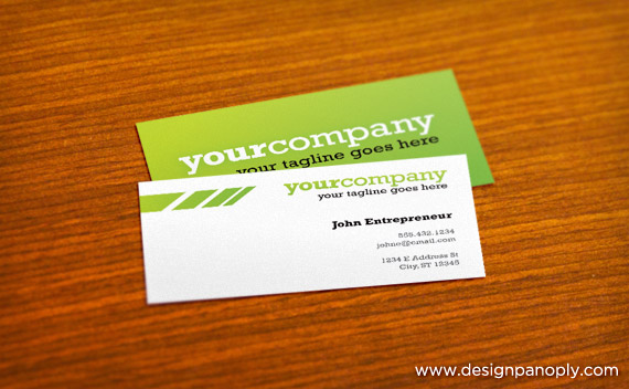
Create A Business Card Mockup In Photoshop Using The Vanishing Point Filter
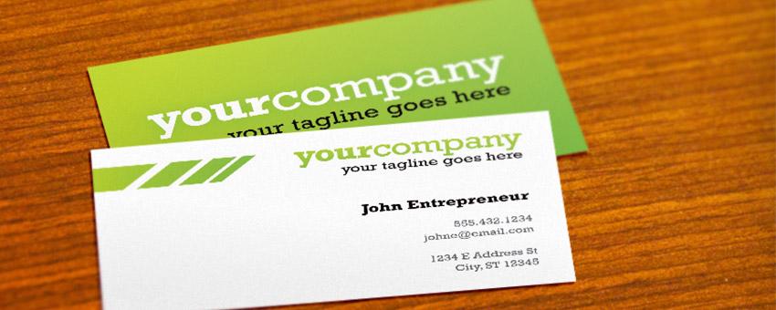
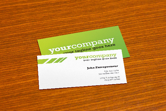
This tutorial will teach you how to take a photograph of an existing business card and use it to create a digital mockup with the Vanishing Point filter within Photoshop.
With some basic shading using Photoshop layer styles we will make it look like an actual photograph.
The techniques used in this tutorial can be applied to create realistic product presentations without all the hassle of printing and cutting out paper items.
What You Will Be Making
Step 1
First, you'll have to take a couple of pictures. Using a tripod, take a photo of an existing business card, or even just a piece of paper, from your desired angle. This photo will be used to create the proper perspective with the Vanishing Point filter in Photoshop.
I used a mostly white card and painted over any lettering that might be a distraction to make it completely white.
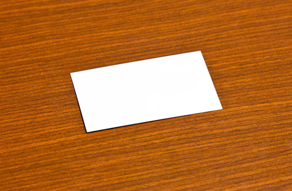
Without moving the camera, remove the business card and take another photograph. This will be used as the background to place your digital files.

Step 2
Create a new document, ours is 1040px x 680px, and paste your photographs in, each as a separate layer.
Hide the layer of the photo without a business card.
Create a new layer above all the rest.

Step 3
Open one side of your business card template. We used one of the nine found in our Clean and Colorful Business Card Templates.
Press CTRL + A to select the entire file and copy it by pressing CTRL + C.

Step 4
Back in your working document, and with the empty top layer selected, click Filter > Vanishing Point.
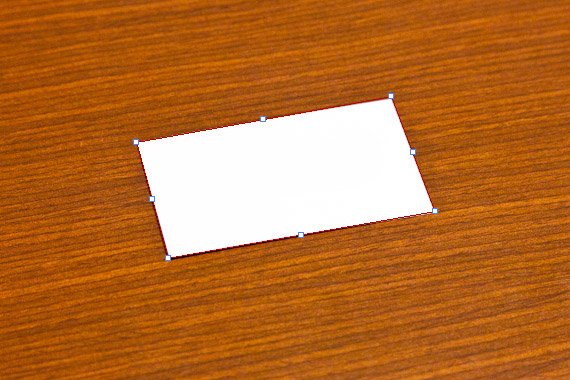
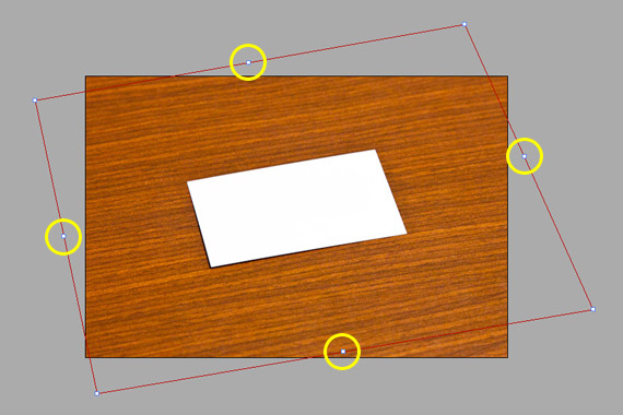
Click on each of the four corners of the business card to create a new plane.
Step 5
Click and drag the sides of the plane outward to increase the size of the plane to cover most of the background image.
Step 6
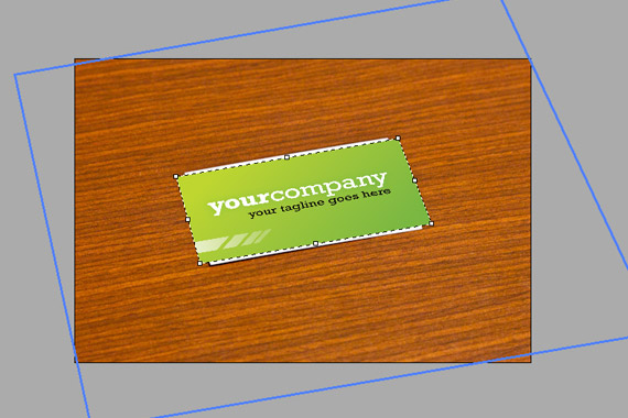
Paste your template in by pressing CTRL + V.
Drag it onto the plane and you will see it conform to the perspective of the plane you created.
Use the Transform Tool to resize and rotate the business card into position and click OK.
Step 7
Open the other side of your business card template, select it, and copy it.

Step 8
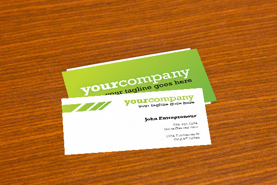
Back in your new document, create a new layer and repeat the previous steps to paste in the second side of your business card.
Step 9
At this point, you are doing using the Vanishing Point filter and the photograph with the existing business card in it.
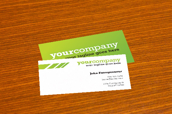
Hide the photograph layer that contains the existing business card and show the photograph layer of the empty desk top.
Step 10
Double click or right click the layer name in the Layers palette and select Blending Options to bring up the layer styles dialog and apply the following settings to the two layers containing your business cards.
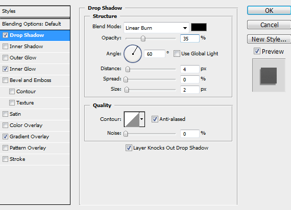
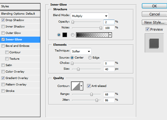
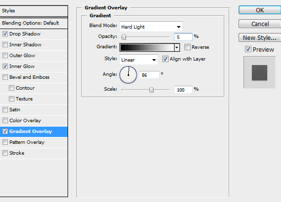
Your cards now have some lighting effects and shadows beneath them.
Step 11
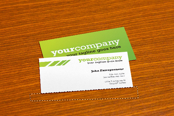
The edges of the cards may be a little jagged after using the Vanishing Point filter.
Use the Polygonal Lasso tool to select the very edges of the business cards and delete any jagged edges.
Step 12
Select your background desk top layer, and using the blur tool at a strength of about 50% with a soft brush, blur the top right and bottom left corners. This is to simulate stronger depth of field.
Do the same to the bottom left corner of the white business card side layer and the top right corner of the green business card side layer.
Step 13
To add the final touch of realism, we'll want to make the lighting even across all elements of the image.
Create a new layer on top of all the rest and fill it with white.
Change the Fill opacity to 0% in the Layers palette.
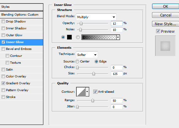
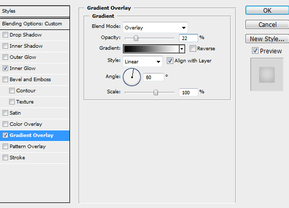
Apply the following settings to the layer Blending Options.
Final Image
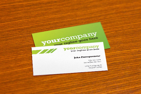
That's it. You now have a realistic mockup of your custom business card design.
These mockups are very impressive and can give you the edge you need to secure that on-the-fence client.

