How to Make a Font: The Creation of Hensel

There are plenty of times where I go looking for a font, only to be let down when I find something close, but not quite perfect. It's been a long time goal to fill this void and design some fonts of my own that other people would find useful enough to buy. To go along with the release of our first font Hensel, I want to share the process behind creating my first commercial font.
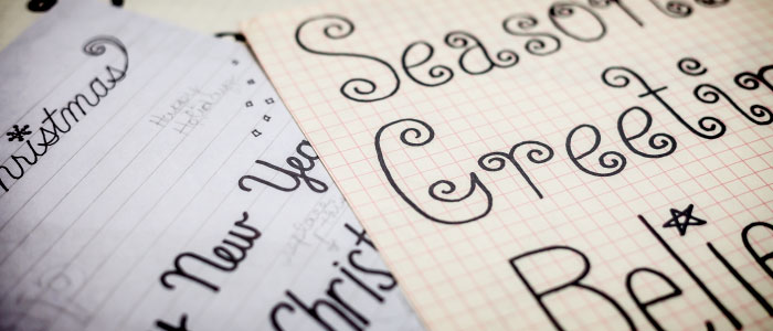
In the past, I made fonts the semi-old fashioned way. I would draw the letters on paper with a black marker, scan them in, live trace them in Illustrator, copy the shapes into font creation software, and tweak things from there. It worked, but it was too slow and the end result just wasn't good enough.
The Problems with the Old Method
The process I described above is fine if you want to learn how to create a font from a technical standpoint, but I found it to be limited. There were two main issues I was having.
- It was tedious. Sometimes I'd draw the same letter 50 times until I got the shape that I liked. There's no "undo" with pen and paper, so sometimes it would take an entire sheet to design a single letter.
- The quality was lacking. I could scan my letters in at 1200dpi, but it didn't matter. The live trace function in Illustrator isn't accurate enough to capture the details from the original. Straight, fixed width lines turn out a bit abnormal even in the best case scenario.
I don't know why it took me so long, but it finally dawned on me that fixing my problems was easy.
Going 100% Digital
The get rid of these problems, I knew I had to work in a digital format from the start.
This allowed me to do two things to completely bypass the negative part of creating fonts.
- Design in a way that was resolution independent.
- Undo mistakes and make changes much more quickly.
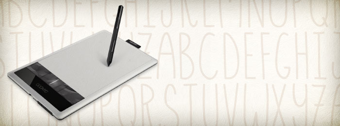
I bought a new Wacom tablet, and life will never be the same.
Drawing the Lines
A graphics tablet takes some getting used to, but once you get the hang of things, it's no different than drawing on paper, with added benefits.
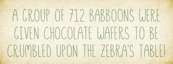
I created a very basic grid to keep all my letters the same height. Hensel was going to be an all uppercase typeface from the start, which made things a bit simpler.
There's no secret behind the way I drew my lines. I used a 1pt basic brush to keep a uniform width throughout the design.
I simply drew each letter one at a time. If I didn't like the initial shape, I'd just "undo" a couple times and try again until I liked what I saw. I didn't want things too perfect because Hensel is meant to look hand drawn, but I also wanted to avoid anything too sketchy.
I think this is the most important part and is what sets professional and amateur fonts apart.
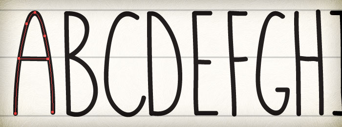
I used my keyboard for reference, and included glyphs for every letter, number, and symbol I saw. Everything except for the stupid "back tick", because I've never used it in my life.
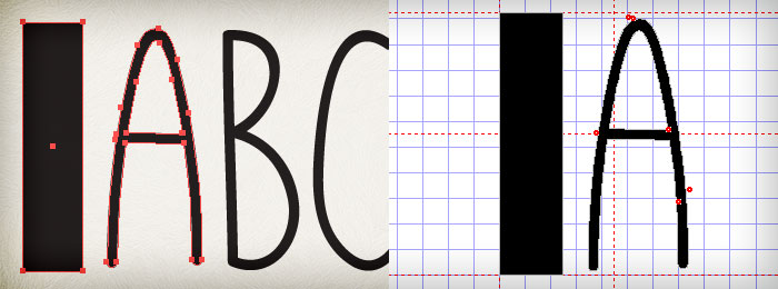
After all the lines were drawn, I went back and tweaked handles to adjust anything I deemed too far out of whack.
I made a copy of all my line work, expanded them to shapes, and used the pathfinder tool to merge overlapping items into a single shape.
Turning the Vector Shapes into a Font
There's a lot of font software out there, but my favorite is FontCreator, obviously because of its creative name.
Unfortunately, free font creation software is hard to find, but there are some cheaper alternatives to FontCreator out there.
FontCreator allows you to copy shapes from Illustrator and paste them directly into each individual glyph. How much easier can it get?
Before copying and pasting though, there's one last step.
To make sure all your letters stay at the scale you designed them in, you need to create a reference block that you'll copy into each glyph. Without it, some font creation software will resize your shapes to a uniform height, which is not what you want since every letter/number/shape is a different size.
Here comes the tedious part. I selected my reference block and one letter at a time, and copied them from Illustrator into the corresponding glyph within FontCreator. After that, I'd delete the reference block from the glyph, move the letter to line up with the start guide, and move the end guide to allow for a little extra space after each letter.
Rinse and repeat a hundred or so times and you have a font!
The Final Touches
Once all the glyphs were pasted in, I tested the font by typing a ton of random words and phrases. If any spacing seemed off relative to the other letters, I'd go back into that glyph and move the guides to balance things out.
Normally, I'd set kerning for every pair of letters, but in this case, the small difference in letter spacing added to the overall effect of the font.
Then it was just adding the font info, saving it, and zipping it up for sale.
Buy Hensel Now
One of the best things about being your own type foundry is that you can set your own prices. In my opinion, $49 is too high for a single member of a font family, and luckily I get to do something about it!
Hensel is just $10 and you can get it as an instant download now.
Click here to see more preview images and buy Hensel.
Create Your Own
I create a lot of design resources, but it's a different, more satisfying feeling to finish a font. I'm looking forward to the day when I see it in use and know that I contributed something that is helping other designers.
Have you ever created a font of your own? Do you have any other font creation tips that improve the process?
Related Items
Grab a PanoPass now and get instant access to all these items and much more.
