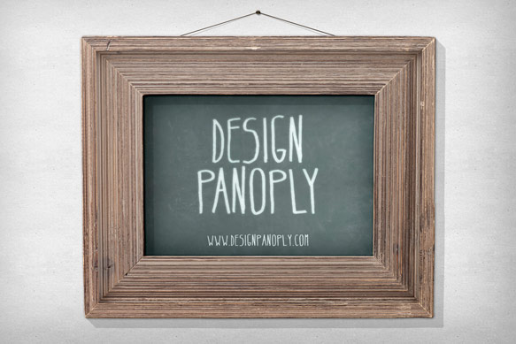
Realistic Vintage Poster Print in a Picture Frame
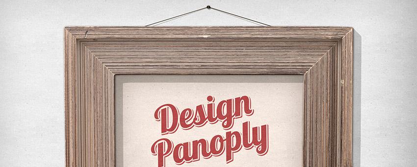
Using real life elements in your designs is a great way to add interest without spending hours creating something from scratch.
This tutorial will show you how to create a realistic picture frame and poster using layer styles, textures, and a vintage wooden picture frame.
Let's get started!
What We Will Be Making
Step 1
Create a new document with dimensions of 1920 x 1280 pixels, unlock the background layer, and fill it with white.
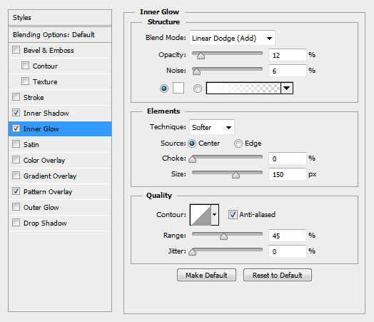
To add some subtle texture and lighting effects, apply the following Layer Style settings, using this seamless natural paper texture for the Pattern Overlay.
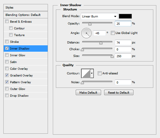

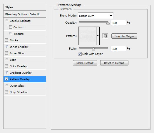
You should end up with something similar to the image below.

Step 2
Find a frame that fits the style you are aiming for in your design. We used a frame from our Isolated Natural Wood Picture Frames 1.
If you are using your own, simply photograph the frame, making sure the lighting is fairly even across the entire image. Cut it out using the pen tool and place it in your document.
Apply the following Layer Style settings to match the lighting to your scene.
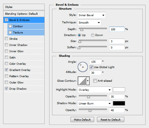
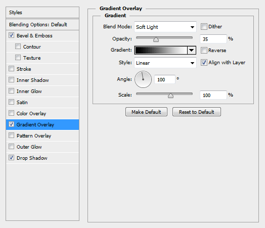
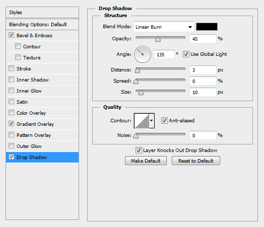
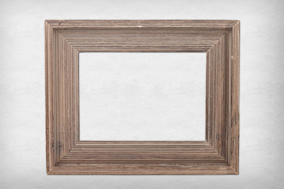
You should end up with something similar to the image below.
Step 3
To create the shadow for the picture frame, duplicate your frame layer, move it below the original frame layer, and clear the Layer Style settings.
Apply the following new Layer Style settings.
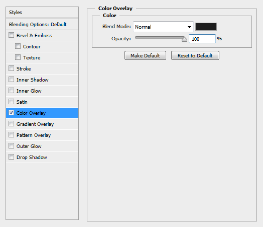
Convert the layer to a Smart Object.
You should end up with something similar to the image below behind your picture frame.
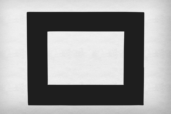
Step 4
With your shadow layer still selected, hold ALT and press the right arrow. This will create a duplicate of your layer and move it 1 pixel to the right. Press the down arrow once.
Your duplicated shadow layer is now 1 pixel over, and 1 pixel down.
Repeat this process 20 times to create the shadow. The key strokes are ALT + Right Arrow, Down Arrow, then repeat.
Once you have about 20 layers created, select them all and Convert them to a Smart Object to combine them into a single layer.
Set the layer Blend Mode to Linear Burn and the Opacity to 20% in the Layers palette.
You should end up with something similar to the image below.
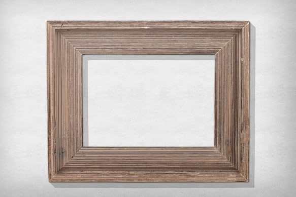
Step 5
Underneath your shadow layer, draw a box that is slightly larger than the inner part of the frame.
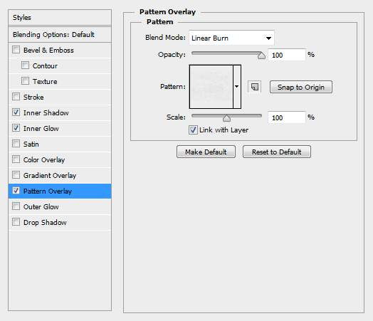
Apply the following Layer Style settings, again using the natural paper pattern from step 1 for the Pattern Overlay.
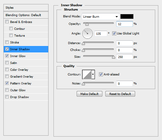
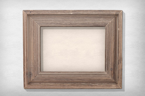
You should end up with something similar to the image below.
Step 6
Create your title text using the color #AD5A5A and the font Lobster.
Rotate your text so that the italicized vertical lines become straight up and down. In our case, it is -12.5 degrees.
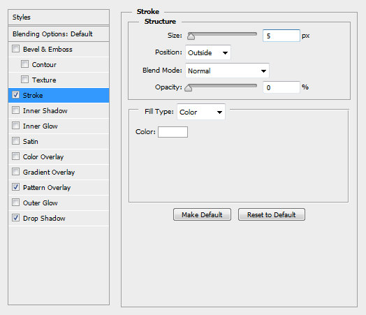
Apply the following Layer Style settings, again using the natural paper pattern as the Pattern Overlay, and the color #A35050 for the Drop Shadow.
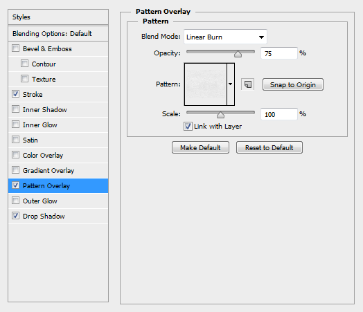
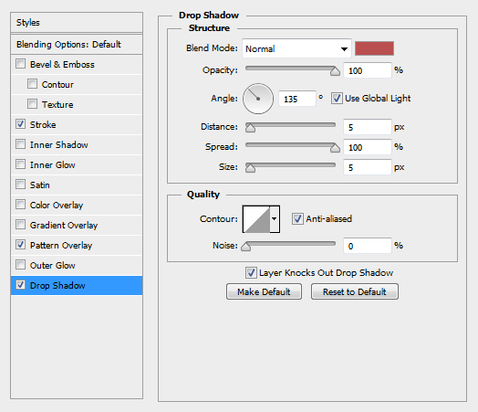
You should end up with something similar to the image below.
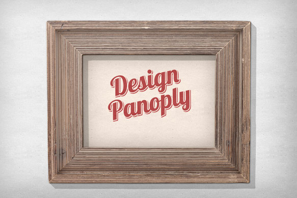
Step 7
Create your subtext using the color #667C9C. We used the font Franchise.
Apply the following Layer Style settings, again using the natural paper pattern for the Pattern Overlay.

You should end up with something similar to the image below.

Step 8
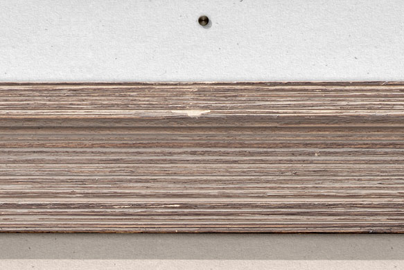
Draw a 25 pixel circle in black using the pen tool and place it above your picture frame.
To give our pin a metallic look, apply the following Layer Style settings, using #221700 for the Color Overlay.
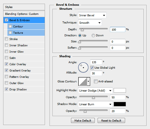
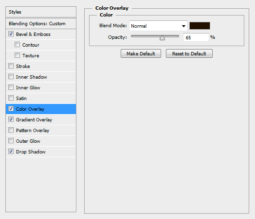
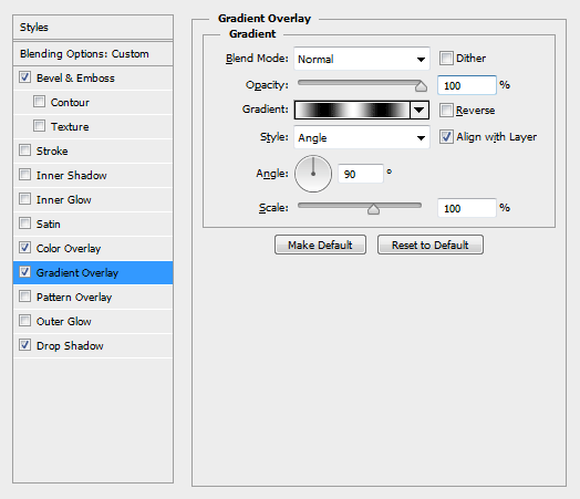
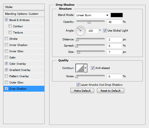
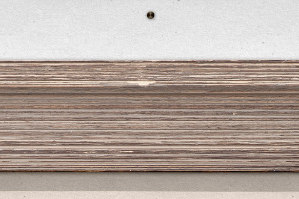
You should end up with something similar to the image below.
Step 9
Duplicate the pin and move it beneath the original pin layer. Clear the Layer Style settings.
Move it 5px right and 5px down.
Set the Blend Mode to Linear Burn and the Opacity to 20% in the Layers palette.
You should end up with something similar to the image below.
Step 10
Using the Line tool, draw a couple 3-pixel-wide, black lines from the pin to behind the frame. Adjust the layer ordering so they are behind everything except our background.
Set the Fill to 0% in the Layers palette and apply the following Layer Style settings, using the color #494136 to add some depth to our wire.

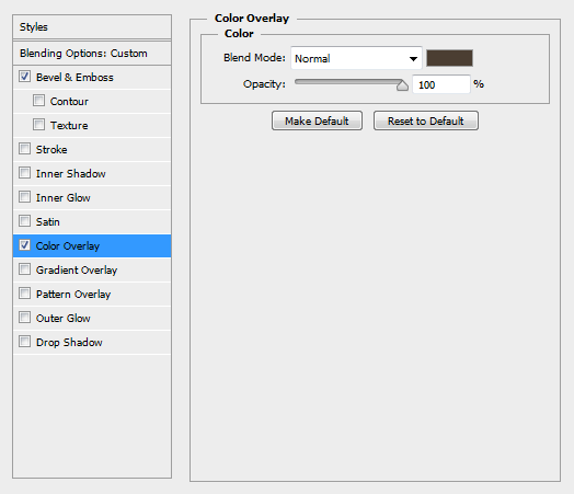
You should end up with something similar to the image below.
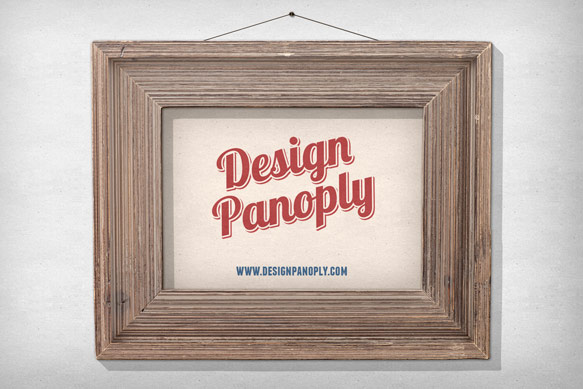
Step 11
Duplicate your wire layers and clear the Layer Styles. Move them beneath the original wire layers.
Rotate them inward and move them so they are at a sharper angle and just inside the wire.
Set the Blend Mode to Linear Burn and the Opacity to 20% in the Layers palette.
Final Image
Alternate Images
Once you have your image complete, you can replace the inside with something new like a chalkboard or whiteboard. The possibilities are endless.
What do you think? Did you learn something new in this tutorial? Show us your version below or on Facebook.


