Create A 3D Business Card Mockup In 3D Studio Max
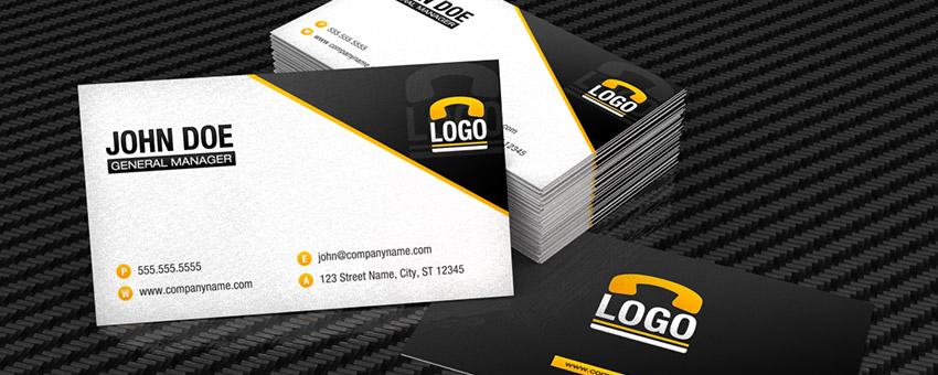
In the design world, presentation is everything. Whether you are making templates to sell to other designers, or creating something custom for a client, the way in which you present it can give it the perfect touch of professionalism and attention to detail that takes your design to the next level.
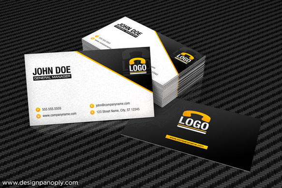
Today we will be looking at how to create a realistic, yet stylized, business card mockup in 3D Studio Max 2011 using the Mental Ray renderer. It's a great way to show others what a print template will look like without having to go through the hassle of creating a physical copy first.
What We Will Be Creating
Step 1
Open a new document in 3D Studio Max. We are using version 2011 in this tutorial, but the principles apply to any version.
Create a new plane that is about 200 square units in size, and centered in your file.
Tip: Create the plane in the top view. Make sure grid snap is on (S), start your click in the very center of the grid, and hold CTRL while you drag outwards to center the plane, you can then resize it in the modify panel to whatever size you wish.

Step 2
Next, create a box that is 35 x 20 x 0.15. This is equivalent to a 3.5" x 2" business card that is 15pt thick.

Step 3
Right click the box and choose Convert To > Convert to Editable Mesh.

Step 4
Next we will create the material for our table surface. Press M to open the material editor. This tutorial shows you how to create the materials within the Legacy Material Editor as opposed to the new Slate Material Editor, but either one works fine.
To set the Legacy Material Editor as your default, click and hold on the Material Editor button and choose the first option. Note: The Material Editor Button is in the top toolbar next to the Render Setup button.
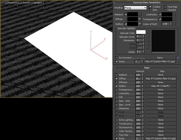
Choose the first material slot, create a new Raytrace material, and name it Table Surface. First change the diffuse color to black, then click the button for the Diffuse Map, select Bitmap, and choose your desired image. We used a modified version of a Carbon Fiber Texture from Spoon Graphics.
We set the tiling to 3 in both directions, and changed the Blur to 0.01. Go back to the main material window, set the Diffuse amount to 50, then drag the M button next to the Diffuse slot into the Bump slot as an Instance, and change the strength to 3.
In the Reflect slot, select Falloff, change the white color to a dark gray, and the Falloff Type to Fresnel.
Select the ground plane and apply the material. Click the Show Standard Map in Viewport button within the Material Editor to show the bitmaps within your viewport.
Step 5
Click on a new default material slot. Change the ambient color to black, the diffuse color to something almost white, and check 2-Sided. Name this material Business Card Sides and apply the material to the business card.

Step 6
Create a new Raytrace material. In the Diffuse slot, choose the image of the front of your business card and set the blur to 0.01. The image should be 3.5" x 2" in size.
In the Reflect slot, choose Falloff, change the white color to a medium-dark gray, and set the falloff type to Fresnel.
We also set a very slight Noise based bump map, this is optional and is only really visible in high resolution renders.
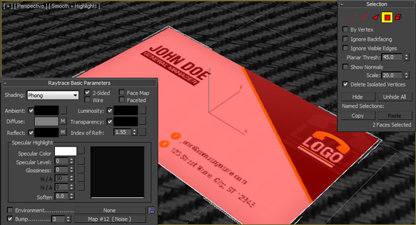
Select the business card model in your viewport, and in the Modify Panel, click the Polygon selection tool and click the face of the business card to select it. In the material editor, choose your business card material and apply it, making sure the button is checked to show the bitmap in the viewport.
Click the polygon selection button again to turn polygon selection mode off.
You may need to rotate your material in order for it to fit the face of the business card properly, depending on whether your design is vertical or horizontal.
Step 7
With the business card selected, click Tools > Array. Click the Preview button so you can see the changes as we make them.
Under the Incremental column, change Y (or Z, depending on how the box was created) to 0.16 in the Move row, choose Instance under Type of Object, and use a count of 50 with 1D selected. This will create stack of 50 business cards with a .01 unit space between them.

Step 8
This next step is optional and a little tedious, but adds to the realism of the scene.
Starting from the top of the business card stack, select each card one at a time in the Left viewport, and CTRL + Click (so as not to lose your selection) an empty area in the top viewport and move each card very slightly on both horizontal axes.
Repeat this step to stagger the cards in the stack.

Step 9
Select the bottom card in the stack, right click and clone it with Copy as the clone type.
Move and rotate this card into position so that it looks like it is underneath the pile but sticking out.
Make a copy of the business card front material, and replace the bitmap with your image of the rear of the business card.
Using the same techniques as you used in step 6, apply the material to the face of the sticking out business card.

Step 10
Select the top card in the stack, right click and clone it with Copy as the clone type.
Move and rotate this card into position so that it looks like it is leaning against the stack. For the most real effect, make sure it is tilted to look as if it is laying on top of both surface of the table and the surface of the card that is sticking out.

Step 11
Now it is time to light the scene.
Create a new Skylight. Set the intensity to 0.9 and the sky color to pure white.
Also create a mr Sky Portal that is 400 square units, and raised up above the ground plane pointing straight down.

Step 12
Create a new plane that is 100 square units and rotate and position it so that it is hovering above the scene, facing down at a 45 degree angle towards the cards.
Assign the same material to this plane as you did the side of the business cards.

Step 13
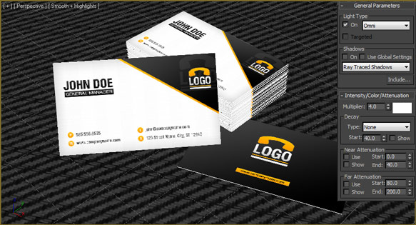
Create a new mr Area Omni light. Set the Intensity to 4.0 and uncheck the Shadows box. Click Include... to open the Include/Exclude dialog box.
Make sure Include and Illumination are both marked, and add only the floating plane to the list on the right side and click OK.
Step 14
In the perspective viewport, move your view around until you are happy with the angle, and press CTRL + C to create a camera. You'll probably have to adjust it after doing some preview rendering, depending on the height:width ratio of your rendered file.

Step 15
We will now set up the render settings.
Press F10 to open the Render Setup dialog.
Under Assign Renderer, choose Mental Ray Renderer, set the View you want, and hit render to see a draft quality preview of your image.

Increase the Antialiasing and Final Gather Precision to increase your render quality for the final image.
Final Product

There are a lot of tweaks you can do to this setup, including different materials, different lighting, and different types of objects.
You can use the ideas shown here to create a mockup template for any kind of print design you can think of.
What do you think? Show us your results in the comments.

